How to Identify and Explore Transitioning Neighbourhoods Using Google Earth
By Brad Canivet
A prime target for real estate investors is older, transitioning neighbourhoods that for a variety of factors, will attract more than their fair share of the regions growth. With a low cost for existing housing stock, these are areas are of a but of growing interest to both renters and owner occupants.
In this article I will introduce a useful tool for investigating such areas in my investment market of Charlotte, N.C.
In larger markets we must look beyond the regions economic fundamentals and dig down to a fairly granular level; such as neighbourhood characteristics. Understanding this level of your target market is important. This is particularly true when looking at U.S. cities, where the boundary between neighbourhoods of differing characteristics (the most notable one, for Canadians, is crime and particularly violent or gun crime) is often dramatic. A block by block or, even street by street analysis may be required.
How do we identify these transitioning neighbourhoods? One strong indicator is transit development and The Transportation Effect on real estate valuations and rental demand as a result of changes in public transit.
Charlotte has a massive LRT investment program underway, which is creating a large number of transitional neighbourhoods. The city has a strong and effective planning and development team. They have produced large amounts of quality information about this program, related analysis and plans, as well as other aspects of the citys growth plans. The Blue Line consists of 15 recently completed stations and the Blue Line Extension currently under construction is to add 11 more.
In the quest for suitable acquisitions we could ask our realtor to look for the type of properties we prefer, within the magic 750 meters of all station areas. However, a supply of our preferred property may not exist in any, let alone all, of themthese areas. Similarly, it may be unreasonable to expect them to have detailed knowledge about, and growth expectations for all of these relatively small areas, let alone the time to go over it with every investor. Alternatively, we could examine reach area and prioritize which areas we think provide the best opportunities along the almost 20 mile route, and possibly adapt our strategy to the type of housing stock available in those areas.
Google Earth is a valuable resource in conducting researching, particularly at a distance. Utilizing both the fly over view of road and development patterns and digging down to Street View, it is a powerful tool when used in conjunction with other information. Although occasionally a little out dated, it still gives investors the ability to virtually walk a neighbourhood from the comfort of your own home.
It is possible to locate the stations with push pins on Google Earth. We can then fly over and walk the streets of these transit affected areas.
However, it is difficult to delineate the prime transit effect zones in either view within Google Earth. Aside from the difficulty of getting a great over view of the chain of transportation affected areas, it is possible to walk out of the target area when zoomed in to Street View.
Earth Survey (http://www.metzgerwillard.us/EarthSurvey.html) provides a number of tools for users of mapping data. One tool that proved useful in solving the problems described above is ; Range Rings for Google Earth (RINGS). You are able to create multiple rings, or solid coverage, in sectors or quadrants to define the study area. The tool allows you to select the colour and thickness of the delineating ring, the distance between rings and the maximum distance from a focal point, with or without a label. These can be saved in Google Earth or in separate files, and the display for each set can be turned on or off.
For the research in Charlotte, I was able to create clearly delineated transit effect rings around each of the stations (see picture #1). I can zoom in or out depending on what information I am trying to integrate into the picture then provided by Google Earth.
Picture #1 Push pins vs Transit Effect Rings in Charlotte, NC

In this picture it is easy to see the dramatic difference between simple push pin icons and rings for identifying areas of potential investigation.
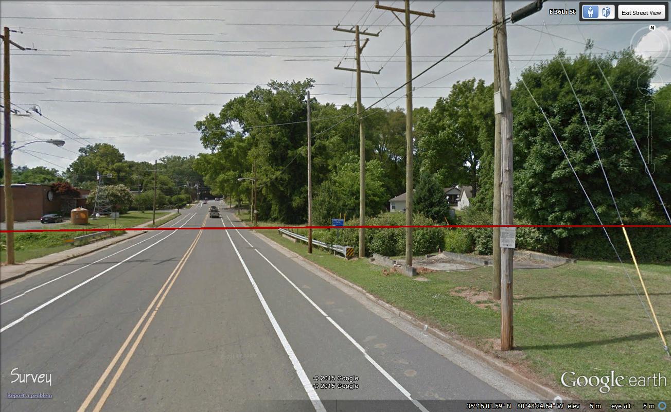
One of the other interesting and valuable features of this product is that in Street View the ring is visible as you walk up to it (see Picture #2). Therefore, you know when you have reached the limit of your target area.
Picture #2 Ring Visualization in Street View

While I have used this tool in conjunction with information about the Transportation Effect, there may be other positive and negative focal points that are of interest in your market or for your target clients. Things such as commuting distances for factory workers; proximity to medical, recreational or educational facilities, recycling or other waste processing operations, or other nuisances may have relevance in the exploration of your market or to you and your investors.
This Range Rings tool can help you utilize Google Earth to explore your market and sub markets in ways you may not have done previously. Whether you are looking at areas suggested by others or being more independent, the images and information you can glean from such an exploration can be used for your basic research, applying your strategy, and in your investor presentations.
For more information on Range Rings for Google Earth (RINGS): http://www.metzgerwillard.us/EarthSurvey.html
Brad Canivet (MBA) is an experienced, research oriented real estate investor and consultant who is building a portfolio of U.S. residential properties. He owns and manages a repurposed multi-tenanted industrial building, in Toronto, is overseeing the last stages of a lengthy environmental remediation of a small development site, and has previously owned, managed and consulted, in the self-storage industry.
{{cta(’92dfd3e1-8286-4159-8cec-029bfec1d748′)}}


